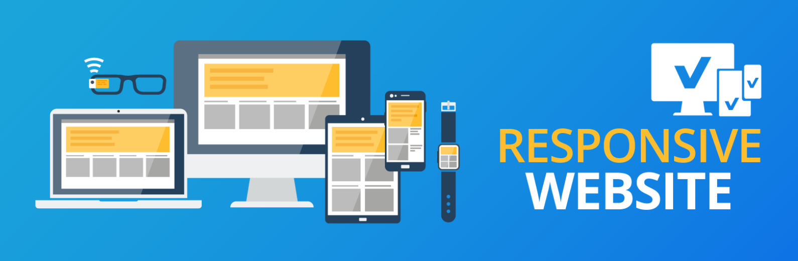


Responsive Web Design: Code, Create, Captivate
We have engineered several leading and secure apps that have allowed businesses to accelerate their growth and fully thrive. With us, you get cutting-edge development.
Get a Free Consultation
We Offer,
Responsive Web Design

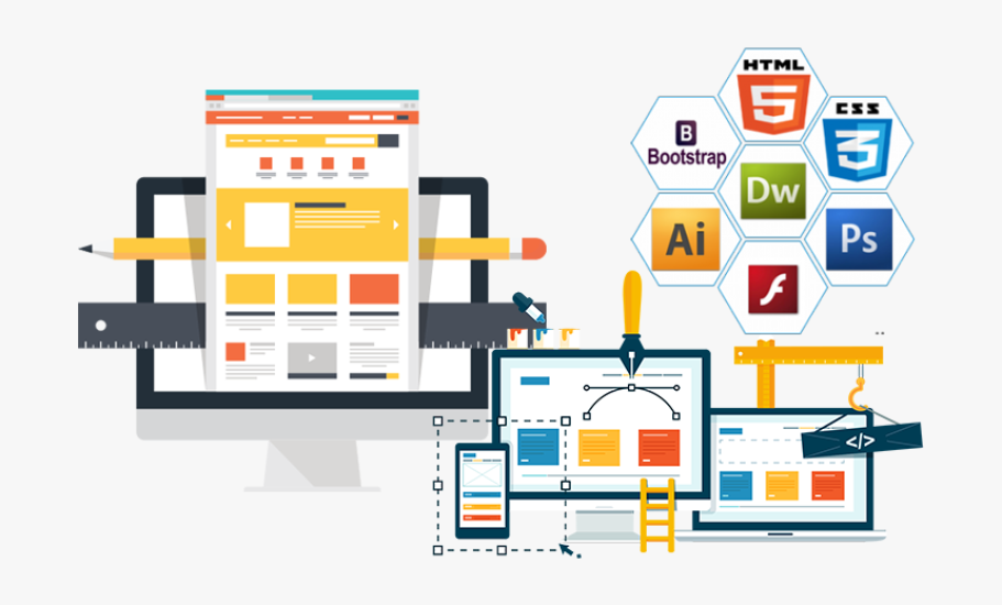
Figma
Figma is a cloud-based design tool used for creating user interfaces, prototypes, and collaborative design work in real-time.

Sketch
Sketch is a vector-based design tool used for creating user interfaces, websites, and prototypes, primarily for macOS.

Ruby
Ruby is a dynamic, open-source programming language known for its simplicity and productivity. It emphasizes readability and supports web development through frameworks like Ruby on Rails.

Swift
Swift is a powerful, intuitive programming language developed by Apple for building iOS, macOS, watchOS, and tvOS apps. It offers modern features, safety, and performance, making it beginner-friendly and efficient for developers.

CSS
Dedicated assistance whenever you need it, ensuring a smooth and hassle

HTML5
Our custom-built services are designed to meet your unique business requirements

Python
Dedicated assistance whenever you need it, ensuring a smooth and hassle

JavaScript
Our custom-built services are designed to meet your unique business requirements

ReactJS
We offer top-quality services at the most competitive rates in the industry.
About This Service
Description of Responsive Web Design
-
Fluid Grid Layouts
- It uses flexible grids that adjust to different screen sizes, allowing elements to resize and rearrange automatically according to the screen’s width.
-
CSS Media Queries
- It uses media queries to apply specific styles for various devices or screen sizes, enabling content to adapt dynamically.
-
Flexible Images
- Images automatically scale and resize to fit their containers, keeping the layout intact on smaller screens.
-
Mobile-First Approach
- Design begins with the smallest screens and progressively adds features and layout improvements as screen size grows, focusing first on mobile users.
-
Consistent User Experience
- Aims to provide a seamless and user-friendly experience across all devices, ensuring that navigation, readability, and functionality remain intuitive.
Our Process
Our experts create a full brief of your requirements and ideas. We translate these into technical documents and early-stage prototypes. We gather a team and build an initial design to lay the foundation for the entire project.

KICK-OFF STAGE
Leverage agile framework to provide a robust high level synopsys overviews

DEVELOPMENT STAGE
Bring to the table survival strategies to ensure proactive domination

SUPPORT STAGE
Grow the holistic world view of disruptive innovation workspace
Questions You May Have
We offer a full range of UI/UX services, including user research, wireframing, prototyping, usability testing, and designing responsive interfaces for websites and mobile apps.
Yes, we involve real users in the testing process to gather feedback and make data-driven improvements to the design.
We use industry-standard tools like Adobe XD, Figma, Sketch, and InVision for designing and prototyping.
Yes, we design user interfaces that align with your brand guidelines to create a cohesive and recognizable user experience.
Reach & Get in Touch With Us!
We'd love to hear from you. Please fill out the form below.
Got a Project ?


Stay Updated with the Latest News and Insights
Subscribe to our newsletter for exclusive updates, expert insights on innovative solutions, the latest tech trends, industry news, and special offers from TecishSol.
Tecish Sol Pvt Ltd, based in Rawalpindi, Pakistan, delivers innovative and scalable web, mobile, and AI solutions. Empowering businesses with expert web development, UI/UX design, and cutting-edge technologies.
Menu
Quick Links
 +92 334 5075089
  info@tecishsol.com
  Bahria Town Phase 7 Rawalpindi
 Social Media
© 2026 Tecish Sol Pvt Ltd | All Rights Reserved